Branding, Color Psychology, Marketing Strategies
What is the Pantone Color Matching System?
How Does the Pantone Color of the Year Affect Marketing Trends?
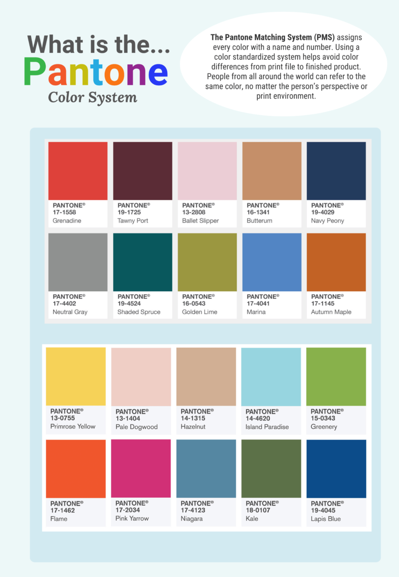
Pantone revolutionized the printing industry by creating its Pantone Matching System (PMS). PMS is a patented numbering system assigned to chips of color and designed to provide consistent and accurate color in production, regardless of the printing equipment being used, anywhere in the world.
What is the Pantone Color of the Year
Pantone LLC was founded in 1962 but didn’t become a household name until debuting its famous superlative in 2000, “Pantone Color of the Year.” According to Leatrice Eiseman, the executive director of the Pantone Color Institute, common reactions to the company’s name included, “You mean the shampoo?” Others wondered if it was a loaf of Italian bread. Regardless, Pantone became a powerful brand and a creative leader for graphic designers, advertisers and marketers.
Since its inception, “Color of the Year” has immensely influenced visual culture across industries and around the world. From fashion and beauty buyers to product and interior designers and manufacturers, it seems nearly every industry takes note of the color forecast from the world’s most influential color system. Take a look at the history of Pantone, learn about each of Pantone’s Colors of the Year and see how it might benefit your marketing strategy.
History of the Pantone Color of the Year
Pantone has annually forecasted a “Color of the Year” based on certain metrics, marketing trends and psychological attributes since 2000. Designers from all industries take note and inspiration from the famous superlative and color palette each year.
Pantone has developed an incredible reputation for its expertise in color. The company has used its patented color matching system in many businesses and industries, helping to influence design choices across a diverse marketing landscape. Partnerships with Lowes, Sephora and JCPenney help to demonstrate just how prominently displayed Pantone’s yearly selection is with immediate product lines and services branching from the Color of the Year choice.
Lowes will create numerous lines for interior designers, home decorators and more that prominently feature the color choice; Sephora will release several make-up products using the color. Companies like Audio UX and Firmenich have helped to develop the selection into a sound and a taste. FedEx has created numerous outlets for Pantone’s color choice that include banners, business cards and graphics. Adobe has even released photography and graphic assets in its own Pantone Color of the Year category.
Check out our print and graphic design glossary where we define some of the terminology used in the print and design industry.
2023 Pantone Color of the Year: Viva Magenta
Pantone has selected the Pantone Color of the Year for 2023…Viva Magenta. You will see this color start to show up in fashion, interior design, graphic design and many other areas.
“An unconventional shade for an unconventional time: a new vision. Color of the Year 2023: PANTONE 18-1750 Viva Magenta Vibrating with vim and vigor, a shade rooted in nature descending from the red family demonstrating a new signal of strength.”
Pantone
“It is assertive, but not aggressive, a carmine red that does not boldly dominate but instead takes a ‘fist in a velvet glove’ approach,”
Pantone
The Pantone Color Institute was founded two decades after the color company and has been championing colors of the year since cerulean blue in 2000.
The program aims to highlight the relationship between color and culture, and colors of the year are chosen because they reflect the global culture at a specific moment in time.
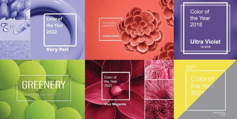
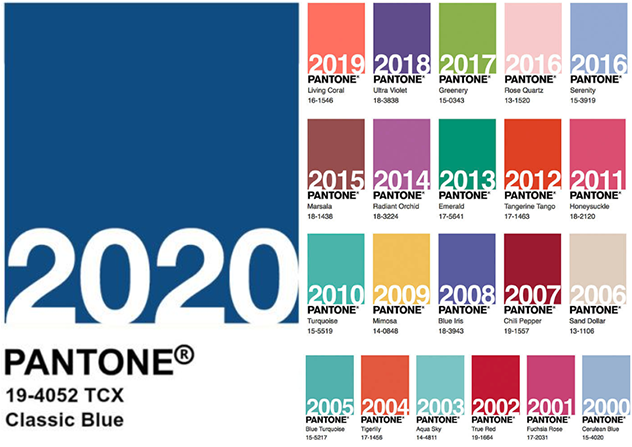
Pantone Colors of the Year 2017-2023?
Pantone, the global authority on color, announces a Color of the Year each year. These colors are chosen based on what is happening in the world and what people are looking for in terms of color trends. Here are the last five Pantone Colors of the Year, along with a brief description of each color and what it represents.
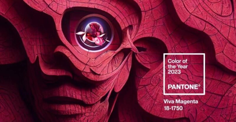
2023 – Viva Magenta 18-1750, Viva Magenta is brave and fearless, and a pulsating color whose exuberance promotes a joyous and optimistic celebration, writing a new narrative.
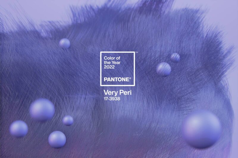
2022 – Very Peri: Very Peri helps us to embrace this altered landscape of possibilities, opening us up to a new vision as we rewrite our lives. Rekindling gratitude for some of the qualities that blue represents complemented by a new perspective that resonates today.
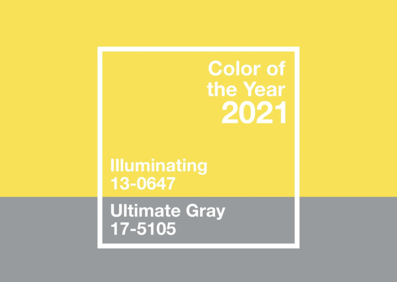
2021 – Illuminating Yellow: This bright and cheerful yellow was chosen as the color of the year for 2021. It represents hope, positivity and the promise of a new dawn.
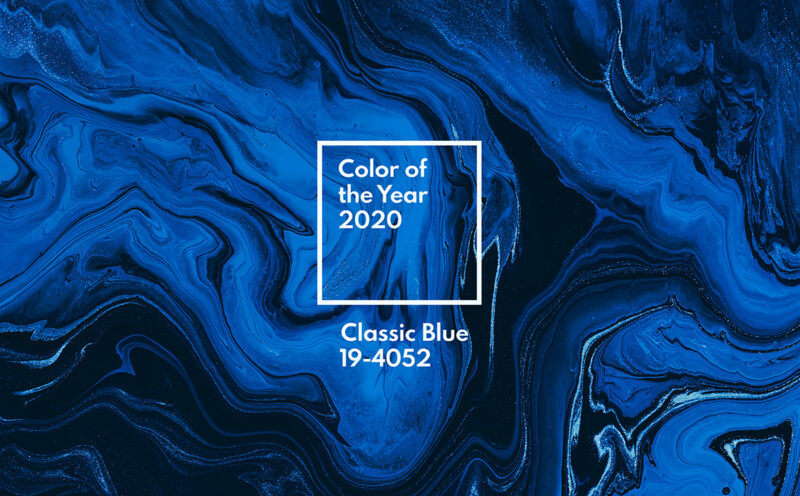
2020 – Classic Blue: This timeless, deep blue shade was chosen as the Color of the Year for 2020 because it represents the need for stability and calm in a world that can feel increasingly uncertain.
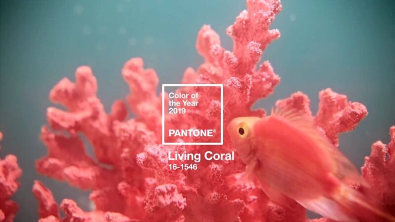
2019 – Living Coral: This warm, pinkish-orange color was chosen as the Color of the Year for 2019 because it represents the need for optimism, comfort, and connection in a rapidly changing world.
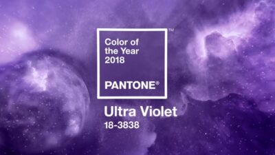
2018 – Ultra Violet: This deep purple hue was chosen as the Color of the Year for 2018 because it represents creativity, individuality, and non-conformity.
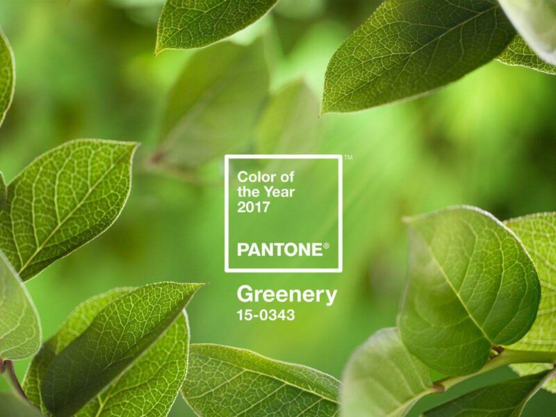
2017 – Greenery, is a yellow-green shade that evokes the first days of spring when nature’s greens revive, restore, and renew. It symbolizes new beginnings and the re-connection to nature. This color is a reminder to take a deep breath, oxygenate, and reinvigorate.
The Pantone color of the year is a reflection of what is happening in the world, and what people are looking for in terms of color trends. Each year, the color chosen is unique, and can be used to evoke different emotions and feelings. It is interesting to see how the color choices have changed over the past five years, reflecting the changes in the world and the moods of people.
Next, let’s examine what effect Color of the Year plays in marketing trends. More importantly, let’s dive into how to implement Pantone’s Color of the Year into your marketing strategy.
How Does the Pantone Color of the Year Affect Marketing Trends?
Pantone’s Color of the Year can have a significant impact on marketing trends because it is widely recognized as a leading authority on color in the design industry. The selection of a specific color as the “Color of the Year” often sets a trend for that color to be used in various forms of design and marketing, such as fashion, home decor, and packaging. Businesses may incorporate this color into their branding and marketing materials to stay current and appeal to consumers. Additionally, companies in the paint, textile, and fashion industries may adjust their product lines to reflect the chosen color.
How Can This Year’s Color Viva Magenta Benefit Your Marketing?
Using Vibrant Magenta in your campaigns can help your brand to stand out and be remembered. Magenta is a very attention-grabbing color, it can be used to make your marketing materials more eye-catching and memorable. It can also be used to create a sense of playfulness, fun and excitement, which can be particularly effective for brands targeting younger consumers.
You can use Magenta in your social media graphics, website design, packaging, product photography and point-of-sale materials. It’s also a good idea to use it in combination with Ultimate Gray to create a sense of balance and stability.
Incorporating the 2023 Pantone Color of the Year, Viva Magenta, into your marketing campaigns can help your brand to be more memorable, eye-catching and positive. It’s a great way to stay on-trend and connect with consumers.
To implement Pantone’s Color of the Year into your customer communications or learn more about FSSI’s precise color match expertise, request a complimentary demo today or contact an FSSI Color Specialist at 714.436.3300.

Sources:
https://www.pantone.com

